

Whenever it comes to animation, thereŌĆÖs something so fascinating about it. ItŌĆÖs much different from the real world, and animation allows people to do things that you couldnŌĆÖt do in reality. And I kinda need to love animation, since I to wish to work in animation. Now, I canŌĆÖt draw to save my life. All I can do is write, and thatŌĆÖs about it. But I still love the animation of cartoons and animes, and even video games. So, today, I want to share with you all animation styles by creators that I love the most. Some you may like, and some I may get you to like. So, letŌĆÖs start with the animation that I love.
Jamie Hewlett (Gorillaz, Tank Girl)
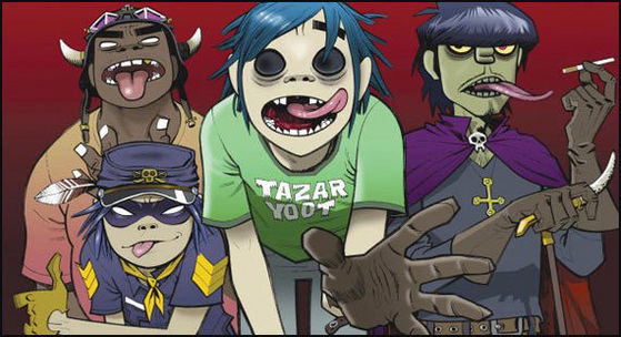
When my mom did nothing but watch music videos on MTV constantly, I remember spotting a video of one of the Gorillaz music videos (I believe it was 19-2000). Ever since then, I have loved the art style of Jamie Hewlett. Sure, the Gorillaz music too is amazing to listen to, but to me, nothing beats that art style. Looking at the thick outlines of the characters makes it great to look at. Not to mention, with all of Jamie HewlettŌĆÖs art, it always looks very colorful to look, with there being lots of effort being put into the character designs. But I think the best thing about The Gorillaz is that they are treated like an animated band, really adding to the animation. And they arenŌĆÖt afraid to try different artstyle, even using some CGI, like in the videos of Stylo. But I always love Jamie HewlettŌĆÖs classic art style a lot more. Very colorful and nice to look at. Tank Girl was also a very wonderful comic series to look at just for the animationŌĆ” The movie sucked though.

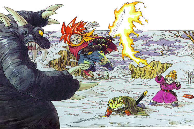
Akira Toriyama (Dragon Ball, Chrono Trigger, Blue Dragon)

Sure, some people say that anime always looks the same in some ways, but no matter what, Akira ToriyamaŌĆÖs work is always recognizable by anyone. The characters always manage to move so fluently during fight scenes as if they are moving fast to hit their opponent, and they are always moving fast, with fast lines in the background or around the characters to really show the style of the movement. The characters also look pretty nice too, with their facial expressions and designs being so much different from most anime that are out around the time. It definitely manages to have some style to it. The same goes for the games, Chrono Trigger and Blue Dragon. They all look so amazing and the characters can easily be defined as a Toriyama design. His work is just so easy to spot. I guess ToriyamaŌĆÖs use of a different kind of art for his characters are what I like about it so much. But, what do you expect with someone as beloved in the anime community as Akira Toriyama?

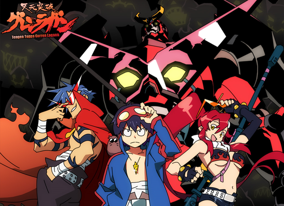
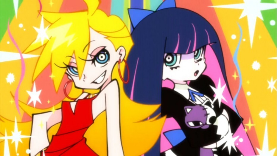
Hiroyuki Imaishi (Tengen Toppa Gurren Lagann, Panty and Stocking with Garterbelt, Kill la Kill)

Surprise, this is an anime. It may look like an American cartoon, but thatŌĆÖs the beauty of Hiroyuki Imaishi. When I first saw Panty and Stocking, I thought the comedy sounded stupid. It was a show filled with sex jokes and obvious penis innuendos. But what pulled me into watching the show and loving it was that art style. I loved it so much. The rugged and western-style animation mixed with a Japanese style was so amazing, I wanted more of ImaishiŌĆÖs work. Thankfully, he made just as talented shows with just as impressive animation. Gurren Lagann has very insane animation, with characters moving in such strange ways that I just love, with Kill la Kill having an amazing plotŌĆ” No, like, literally. Awesome plot, mixed in with impressive fight scenes and colorful animation. I still love all these shows, but if I had to choose which had my favorite animation, than definitely Panty and Stocking, but they are all awesome, as Imaishi is just great with his art.
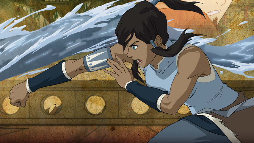
LeSean Thomas (The Boondocks, Black Dynamite, Legend of Korra)
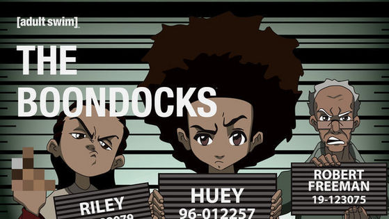
Wait, the guy who worked on the offensive and adult cartoon of The Boondocks worked on Legend of Korra. Crazy, I know, but also pretty cool. LeSean Thomas's work is very amazing, since it manages to have the art style of an anime, yet not at all be an anime. The characters manage to have the right lip sinking, but also be very detailed at the same time, and donŌĆÖt forget the incredible fight scenes. For a show that was meant to be satire, The Boondocks managed to have some of the most awesome fight scenes IŌĆÖve ever seen. Black Dynamite, a cartoon based on one of the best action films of the past decade, just added to the insanely amazing action scenes. And while Legend of Korra wasnŌĆÖt as violent or as crude, it still managed to have some impressive backgrounds and character designs, so for that, I can at least say that all of LeSeanŌĆÖs work is amazing, even if the demographic changes sometimes.
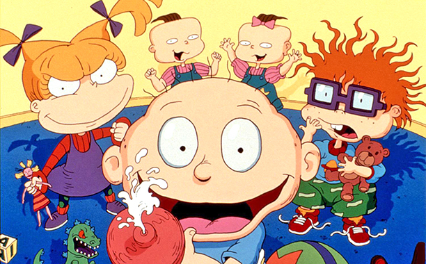
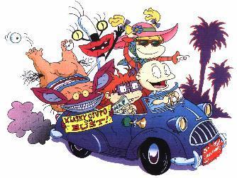
Arlene Klasky and Gabor Csupo (Rugrats, Wild Thornberrys, Ahh! Real Monsters, etc.)
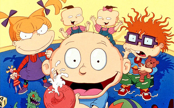
Hell, what didnŌĆÖt they make. Sure their art style may look a bit crude at times, and sometimes, it can just look disgusting, but I kinda like it. ItŌĆÖs not the best with itŌĆÖs character designs, but it looks amazing with itŌĆÖs backgrounds and the color shading. I always liked some of the designs of the locations and the settings. They all look so bizarre and creative with each different setting. Whenever Klasky Csupo wants to try something weird, but also unique and creative looking, they can do it, and it always works (Most of the time). If they want to make talking babies good, they can. If they want to make a cynical duck good, they can. If they want to make a man with bad luck goodŌĆ”.. Eh, better luck next time with that one. Still, the shading and colors are what I like most about their work. Not the best with the character designs, but damn if the rest isnŌĆÖt some of the best work out there.

One (One Punch Man)
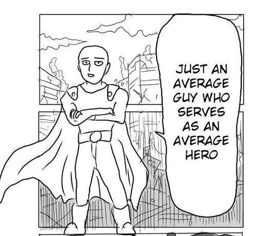
IŌĆÖm sure, looking at this art, most of you are thinking ŌĆ£What in godŌĆÖs name is thisŌĆØ? Well, as it turns out, One Punch Man started as a webcomic by a creator by the name of One. His parents didnŌĆÖt want him to be a manga artist, so he did it in secrecy, and, even though he couldnŌĆÖt draw, he still did it no matter what. He was then met with a professional manga artist, who said to him ŌĆ£I can help make this a bit easier on the eyesŌĆØ. And so, they created the manga of One Punch Man, which eventually was made into one of the best anime of all time, and for good reason. Sure, the art may not be good, but I like OneŌĆÖs art for itŌĆÖs backstory. ItŌĆÖs as amazing as the anime Bakuman. It manages to inspire many people to do what they want, even if they canŌĆÖt do it, they just need to try. I respect One for those very things, and thatŌĆÖs why I love this art. Because OneŌĆÖs determination is what I love. But seriously, this art is not the best.

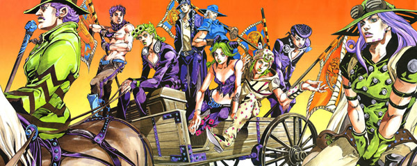
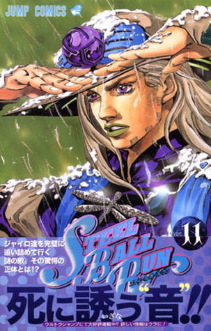
Hirohiko Araki (JojoŌĆÖs Bizarre Adventure)
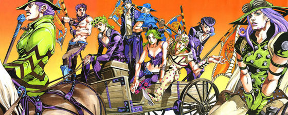
When I say HirohikoŌĆÖs art, I donŌĆÖt mean the first three parts. While their good, I much prefer the art style to parts four through eight. Sure, you may not like it as much as the original, but I think itŌĆÖs pretty cool. The change in the artstyle changed the characters from giant muscular macho men into very flamboyant individuals, with a lot more color and bizarre movements. The Stands in this series were always amazing to look at, but I really like them here. So much color and designs, and their abilities shown on the manga are also pretty cool. Sure, the lipstick may look a bitŌĆ” odd, but you get used to it after a while. ItŌĆÖs just a thing weŌĆÖve all come to accept. The poses in the manga and anime are in some strange fashion. Some look awesome, some are okay, and some look so damn impossible. Like, did the characters break their bones just to do those poses? Still, they look pretty cool. The anime has some pretty good animation as well from the manga. I really canŌĆÖt wait to see Steel Ball Run, my favorite arc, put into an anime. Until then, we still have Part 4, which I really like. I just wish I could get more from this art style instead of waiting for the next manga issue or the next episode of Diamond is Unbreakable. Guess you could say I still canŌĆÖt get enough of the style.

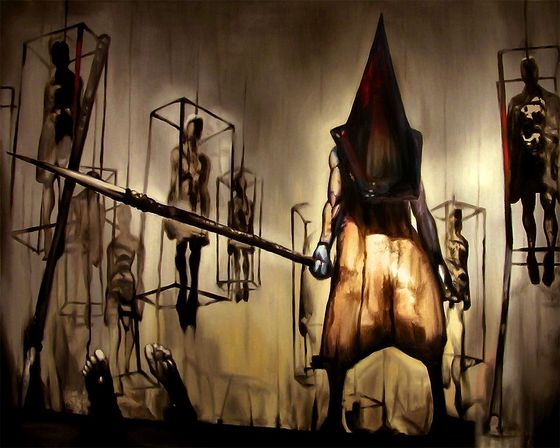
Masahiro Ito (Silent Hill)
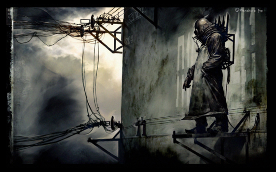
Finally, an artist who creates horror. IŌĆÖve always loved all of MasahiroŌĆÖs art. Silent Hill 1ŌĆÖs monsters were always these strange demonic creatures. They were creepy, but they were even better in Silent Hill 2. They all had a design and look that were actually important to JamesŌĆÖs character. Silent Hill 3 also had some amazing monsters in them. They all look so dark, scary, and are just so unimaginable by any other human. That is what I like about MasahiroŌĆÖs art. ItŌĆÖs all so creepy (Of course it is. ItŌĆÖs a horror game). All the monsters are just so creepy to look at. All are something you wouldnŌĆÖt except. What makes a monster so creepy is the design. If the design is creepy, than the person who sees the monster is expected to be creepy. That is what makes MasahiroŌĆÖs monsters and creations great. I can say heŌĆÖs like the H.R. Geiger of JapanŌĆ” Maybe a bit much? I donŌĆÖt care. ItŌĆÖs great.
Jamie Hewlett (Gorillaz, Tank Girl)
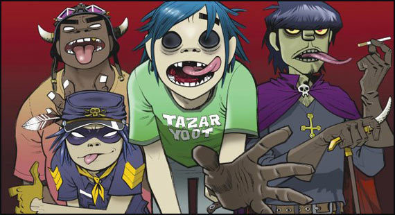
When my mom did nothing but watch music videos on MTV constantly, I remember spotting a video of one of the Gorillaz music videos (I believe it was 19-2000). Ever since then, I have loved the art style of Jamie Hewlett. Sure, the Gorillaz music too is amazing to listen to, but to me, nothing beats that art style. Looking at the thick outlines of the characters makes it great to look at. Not to mention, with all of Jamie HewlettŌĆÖs art, it always looks very colorful to look, with there being lots of effort being put into the character designs. But I think the best thing about The Gorillaz is that they are treated like an animated band, really adding to the animation. And they arenŌĆÖt afraid to try different artstyle, even using some CGI, like in the videos of Stylo. But I always love Jamie HewlettŌĆÖs classic art style a lot more. Very colorful and nice to look at. Tank Girl was also a very wonderful comic series to look at just for the animationŌĆ” The movie sucked though.
Akira Toriyama (Dragon Ball, Chrono Trigger, Blue Dragon)
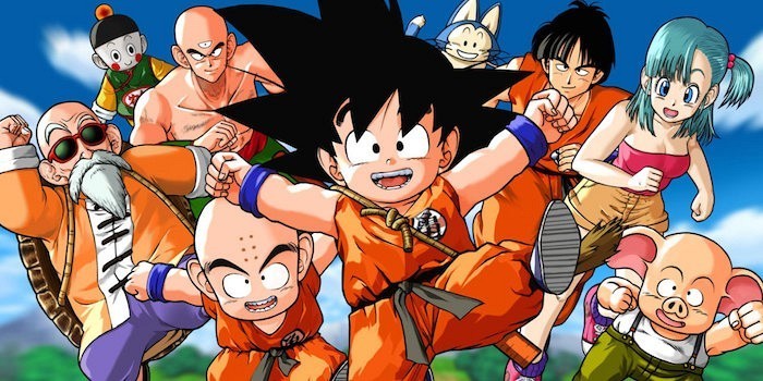
Sure, some people say that anime always looks the same in some ways, but no matter what, Akira ToriyamaŌĆÖs work is always recognizable by anyone. The characters always manage to move so fluently during fight scenes as if they are moving fast to hit their opponent, and they are always moving fast, with fast lines in the background or around the characters to really show the style of the movement. The characters also look pretty nice too, with their facial expressions and designs being so much different from most anime that are out around the time. It definitely manages to have some style to it. The same goes for the games, Chrono Trigger and Blue Dragon. They all look so amazing and the characters can easily be defined as a Toriyama design. His work is just so easy to spot. I guess ToriyamaŌĆÖs use of a different kind of art for his characters are what I like about it so much. But, what do you expect with someone as beloved in the anime community as Akira Toriyama?
Hiroyuki Imaishi (Tengen Toppa Gurren Lagann, Panty and Stocking with Garterbelt, Kill la Kill)
Surprise, this is an anime. It may look like an American cartoon, but thatŌĆÖs the beauty of Hiroyuki Imaishi. When I first saw Panty and Stocking, I thought the comedy sounded stupid. It was a show filled with sex jokes and obvious penis innuendos. But what pulled me into watching the show and loving it was that art style. I loved it so much. The rugged and western-style animation mixed with a Japanese style was so amazing, I wanted more of ImaishiŌĆÖs work. Thankfully, he made just as talented shows with just as impressive animation. Gurren Lagann has very insane animation, with characters moving in such strange ways that I just love, with Kill la Kill having an amazing plotŌĆ” No, like, literally. Awesome plot, mixed in with impressive fight scenes and colorful animation. I still love all these shows, but if I had to choose which had my favorite animation, than definitely Panty and Stocking, but they are all awesome, as Imaishi is just great with his art.

LeSean Thomas (The Boondocks, Black Dynamite, Legend of Korra)

Wait, the guy who worked on the offensive and adult cartoon of The Boondocks worked on Legend of Korra. Crazy, I know, but also pretty cool. LeSean Thomas's work is very amazing, since it manages to have the art style of an anime, yet not at all be an anime. The characters manage to have the right lip sinking, but also be very detailed at the same time, and donŌĆÖt forget the incredible fight scenes. For a show that was meant to be satire, The Boondocks managed to have some of the most awesome fight scenes IŌĆÖve ever seen. Black Dynamite, a cartoon based on one of the best action films of the past decade, just added to the insanely amazing action scenes. And while Legend of Korra wasnŌĆÖt as violent or as crude, it still managed to have some impressive backgrounds and character designs, so for that, I can at least say that all of LeSeanŌĆÖs work is amazing, even if the demographic changes sometimes.
Arlene Klasky and Gabor Csupo (Rugrats, Wild Thornberrys, Ahh! Real Monsters, etc.)
Hell, what didnŌĆÖt they make. Sure their art style may look a bit crude at times, and sometimes, it can just look disgusting, but I kinda like it. ItŌĆÖs not the best with itŌĆÖs character designs, but it looks amazing with itŌĆÖs backgrounds and the color shading. I always liked some of the designs of the locations and the settings. They all look so bizarre and creative with each different setting. Whenever Klasky Csupo wants to try something weird, but also unique and creative looking, they can do it, and it always works (Most of the time). If they want to make talking babies good, they can. If they want to make a cynical duck good, they can. If they want to make a man with bad luck goodŌĆ”.. Eh, better luck next time with that one. Still, the shading and colors are what I like most about their work. Not the best with the character designs, but damn if the rest isnŌĆÖt some of the best work out there.
One (One Punch Man)

IŌĆÖm sure, looking at this art, most of you are thinking ŌĆ£What in godŌĆÖs name is thisŌĆØ? Well, as it turns out, One Punch Man started as a webcomic by a creator by the name of One. His parents didnŌĆÖt want him to be a manga artist, so he did it in secrecy, and, even though he couldnŌĆÖt draw, he still did it no matter what. He was then met with a professional manga artist, who said to him ŌĆ£I can help make this a bit easier on the eyesŌĆØ. And so, they created the manga of One Punch Man, which eventually was made into one of the best anime of all time, and for good reason. Sure, the art may not be good, but I like OneŌĆÖs art for itŌĆÖs backstory. ItŌĆÖs as amazing as the anime Bakuman. It manages to inspire many people to do what they want, even if they canŌĆÖt do it, they just need to try. I respect One for those very things, and thatŌĆÖs why I love this art. Because OneŌĆÖs determination is what I love. But seriously, this art is not the best.
Hirohiko Araki (JojoŌĆÖs Bizarre Adventure)
When I say HirohikoŌĆÖs art, I donŌĆÖt mean the first three parts. While their good, I much prefer the art style to parts four through eight. Sure, you may not like it as much as the original, but I think itŌĆÖs pretty cool. The change in the artstyle changed the characters from giant muscular macho men into very flamboyant individuals, with a lot more color and bizarre movements. The Stands in this series were always amazing to look at, but I really like them here. So much color and designs, and their abilities shown on the manga are also pretty cool. Sure, the lipstick may look a bitŌĆ” odd, but you get used to it after a while. ItŌĆÖs just a thing weŌĆÖve all come to accept. The poses in the manga and anime are in some strange fashion. Some look awesome, some are okay, and some look so damn impossible. Like, did the characters break their bones just to do those poses? Still, they look pretty cool. The anime has some pretty good animation as well from the manga. I really canŌĆÖt wait to see Steel Ball Run, my favorite arc, put into an anime. Until then, we still have Part 4, which I really like. I just wish I could get more from this art style instead of waiting for the next manga issue or the next episode of Diamond is Unbreakable. Guess you could say I still canŌĆÖt get enough of the style.
Masahiro Ito (Silent Hill)

Finally, an artist who creates horror. IŌĆÖve always loved all of MasahiroŌĆÖs art. Silent Hill 1ŌĆÖs monsters were always these strange demonic creatures. They were creepy, but they were even better in Silent Hill 2. They all had a design and look that were actually important to JamesŌĆÖs character. Silent Hill 3 also had some amazing monsters in them. They all look so dark, scary, and are just so unimaginable by any other human. That is what I like about MasahiroŌĆÖs art. ItŌĆÖs all so creepy (Of course it is. ItŌĆÖs a horror game). All the monsters are just so creepy to look at. All are something you wouldnŌĆÖt except. What makes a monster so creepy is the design. If the design is creepy, than the person who sees the monster is expected to be creepy. That is what makes MasahiroŌĆÖs monsters and creations great. I can say heŌĆÖs like the H.R. Geiger of JapanŌĆ” Maybe a bit much? I donŌĆÖt care. ItŌĆÖs great.


WellŌĆ” How about that Bethesda? How about that Fallout 76? How about that Todd Howard and his Sweet Little Lies? Yeah, I am really aware of how cool it is right now to hate on Fallout 76, and I am aware that not a lot of people are fans of Skyrim. In fact, hating it is kind of a law now, but just because 76 is a mistake, that doesnŌĆÖt mean I will grow to hate Skyrim, no matter how many times they re-release it.
Elder Scrolls: Skyrim takes place in, well, Skyrim, as the hero of the story, known as Dragonborn, comes to find that the land is under attack by dragons. So, with the use of...
Anime girls depending on clothing or breast size:
Small breasts, more layers of clothes - Rotten personality. Tsundere. That one bitch nobody likes or for some reason find really cute.

Small breasts, cute, fashionable clothes - So sweet and innocent that they could rot your teeth just by them smiling they're so sweet. Maybe even annoying.

Large breasts, more layers of clothes, or fashionable clothes- Airhead, cute, shy, clumsy. Generally most of the time ends up being the "main girl" of the series.

continue reading...
Small breasts, more layers of clothes - Rotten personality. Tsundere. That one bitch nobody likes or for some reason find really cute.
The only Tsundere I like
Small breasts, cute, fashionable clothes - So sweet and innocent that they could rot your teeth just by them smiling they're so sweet. Maybe even annoying.
I honestly actually kinda like Misa
Large breasts, more layers of clothes, or fashionable clothes- Airhead, cute, shy, clumsy. Generally most of the time ends up being the "main girl" of the series.
I remember this chick...
Remember how great Nightmare on Elm Street? Remember the mystery of Freddy and how the reveal turned out to be rather creepy? Remember all the creepy special effects that, while limited, managed to make the movie even scarier. Well, thanks to the remake done by Michael Bay, we can throw all those out the window, because I got for you all, not a Nightmare on Elm Street classic, but the 2010 remake of the same name, and let me tell you, it sure is a scary movieŌĆ” For completely different reasons.

Now, while Texas Chainsaw Massacre 2003 wasnŌĆÖt really a good movie, it at least had SOMETHING...
continue reading...
Now, while Texas Chainsaw Massacre 2003 wasnŌĆÖt really a good movie, it at least had SOMETHING...


We all play games to actually get away from all the pointless chores of reality. Sadly, though, there are moments in games that throw us right back into reality by making us do the same chores as in reality. Now, a few rules before I begin. Only one game per franchise and only games that I have played. Now, with all that said, lets start the list.

#10: Survivor Chores from Dead Rising - Now, this really isnŌĆÖt pointless, as saving survivors does get you a new weapon, levels you up, or gives you money. However, there are THOSE survivors. You know the ones, the ones that will refuse to...
continue reading...
#10: Survivor Chores from Dead Rising - Now, this really isnŌĆÖt pointless, as saving survivors does get you a new weapon, levels you up, or gives you money. However, there are THOSE survivors. You know the ones, the ones that will refuse to...

ŌĆ”. I suck at keeping a schedule

Would it even matter calling this SWERY month at this point? ItŌĆÖs more like the SWERY Marathon. I apologize for this busted ass schedule. Needless to say, I am going to stop with these big month long events because I canŌĆÖt seem to pull them off properly no matter how hard I try so IŌĆÖm not gonna be celebrating these things for a month. I will have special events still, sure, but just nothing that has a dedicated schedule. Maybe just four things in a row. And with that said, we move on to the final game in the SWERY horror roster. We had many games...
continue reading...
Would it even matter calling this SWERY month at this point? ItŌĆÖs more like the SWERY Marathon. I apologize for this busted ass schedule. Needless to say, I am going to stop with these big month long events because I canŌĆÖt seem to pull them off properly no matter how hard I try so IŌĆÖm not gonna be celebrating these things for a month. I will have special events still, sure, but just nothing that has a dedicated schedule. Maybe just four things in a row. And with that said, we move on to the final game in the SWERY horror roster. We had many games...

So, Halo 2 was a pretty good game, I donŌĆÖt think anyone will deny that. But I always realized something. There was a two at the end. So where could I find a copy of the first one. Every retailer I went to as a kid had Halo 2 everywhere, but little copies of Halo 1. And then, one day, I finally got my hands on it. And it was even better (In some ways).
I think the reason I liked Halo 1 better than Halo 2, despite Halo 2 clearly being a step up, both graphic wise and variety wise, was just how mysterious and mystical Halo 1 felt in a way. The game opens up with Master Chief being woken...

Henry: so... what are you working on?
Simon: none of your concern
Henry: can I help?
Simon: why should I let a insecure 19 year old with no experiences with science help me?
Henry: point taken
Simon: why are you in here?
Henry: I just want to know what you are making!
Simon: a cure for cancer
Henry: how will that help the war?
Simon: not every thing has to be about war... it will help the lives of millions! and some might see the day this chaos ends...
Henry: ok then... whats the progress?
Simon: dead-fuc*ing-end
Henry: welcome to my world